

Toronto Pearson Airport
Wayfinding for Terminal 1 at the international airport

‘Stanley Kubrick: The Exhibition’
Exhibition design for the Design Museum’s Kubrick retrospective
Chrysler Museum of Art
Visual identity for the museum in Norfolk, Virginia.
DC Entertainment
Identity and logo for the iconic entertainment company

‘Designed by Apple in California’
Book design that chronicles 20 years of Apple design

Resonate
Identity, font and glyph system for an international digital arts festival

Starbucks
Environmental installation and augmented reality experience for a Milan flagship

Porsche
Social media campaign for Ramadan, connecting moments of collective celebration and individual contemplation.

Chatsworth
Brand identity for Chatsworth and the Devonshire Group.

‘A Glacier's Requiem’
Book and record cover for photographic and audio recordings of melting glaciers

Manuvo ‘Changemakers’
Branding for a documentary series to promote social change.

‘One Day’
Title card and graphics for the Netflix series based on David Nicholls’s best-selling novel

Curtis Institute of Music
Identity for the prestigious private conservatory in Philadelphia

‘Minx’
Seventies feminist graphics and vintage erotica inspire the magazine design and titles for the streaming comedy series

Isomorphic Labs
Beautiful Symmetry: Pentagram’s new website for Isomorphic Labs creates a new visual language for digital biology

Remission Biome
Brand identity for the radical new patient-centered healthcare organization.

Cooper Hewitt Smithsonian Design Museum
Identity, website, and wayfinding design for the museum

‘Exhibitionism – The Rolling Stones’
Book design for the legendary band's most comprehensive monograph

‘Girls5Eva’
Title animations and graphics for the Emmy-nominated comedy series

William Morris Society
Identity for society dedicated to William Morris, an icon of Victorian Britain

Yale School of Architecture
Promotional posters for the school's lectures and events

Teabox
Identity, packaging, and website design for the tea commerce company

Viren
Naming, strategy and brand identity for a new high-performance activewear and loungewear apparel brand.

'Dear G20 Leaders'
A new campaign calling for global financial reform.

Warner Music Group
A bold and off-kilter brand proposition amplifies the vision and voice of an entertainment icon.

London College of Communication
Wayfinding solution for one of London's best-known design colleges

The High Line
Identity, wayfinding, and promotional materials for the elevated park
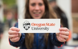
Oregon State University
Logo and identity for Beaver Nation

Berry Bros. & Rudd
Identity and collateral for Britain's oldest wine merchants

Rathfinny
Brand strategy and visual identity for a 600-acre wine estate