

Doris Duke Artist Awards
Campaign announcing the 2024 awardees of the prestigious annual honors presented by the Doris Duke Foundation

Manuvo ‘Changemakers’
Branding for a documentary series to promote social change.

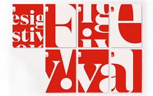
'Dear G20 Leaders'
A new campaign calling for global financial reform.

Isomorphic Labs
Beautiful Symmetry: Pentagram’s new website for Isomorphic Labs creates a new visual language for digital biology

Porsche
Social media campaign for Ramadan, connecting moments of collective celebration and individual contemplation.

Remission Biome
Brand identity for the radical new patient-centered healthcare organization.

‘One Day’
Title card and graphics for the Netflix series based on David Nicholls’s best-selling novel

‘Girls5Eva’
Title animations and graphics for the Emmy-nominated comedy series

‘Minx’
Seventies feminist graphics and vintage erotica inspire the magazine design and titles for the streaming comedy series
Chrysler Museum of Art
Visual identity for the museum in Norfolk, Virginia.

Viren
Naming, strategy and brand identity for a new high-performance activewear and loungewear apparel brand.

Chatsworth
Brand identity for Chatsworth and the Devonshire Group.

Saks Fifth Avenue
Identity and packaging for the iconic New York retailer

Toronto Pearson Airport
Wayfinding for Terminal 1 at the international airport

Mastercard
Brand identity to emphasize simplicity, connectivity and seamlessness
Graphcore
Identity, typeface and pattern generator for a machine learning start-up

William Morris Society
Identity for society dedicated to William Morris, an icon of Victorian Britain

‘Border City’
Digital installation design for the London Design Biennale
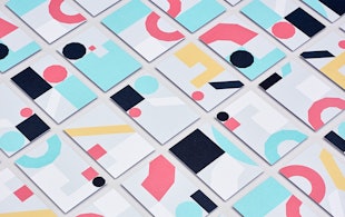
London Design Festival 2016
Pentagram's tenth identity for one of the world's biggest design events
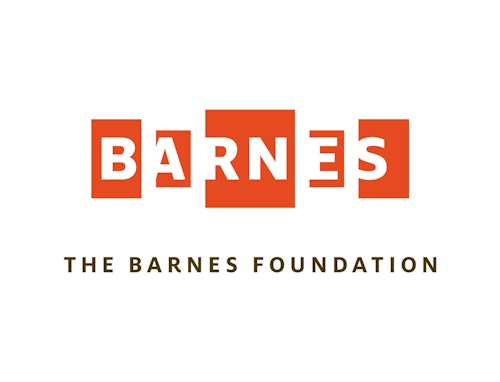
The Barnes Foundation
Identity, wayfinding, and website design for the museum

Leafs by Snoop
Identity, packaging, and website design for Snoop Dogg's marijuana line

‘A Glacier's Requiem’
Book and record cover for photographic and audio recordings of melting glaciers

Cooper Hewitt Smithsonian Design Museum
Identity, website, and wayfinding design for the museum
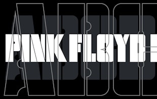
Pink Floyd Records
Identity and record design for the band’s new label

Resonate
Identity, font and glyph system for an international digital arts festival

Rathfinny
Brand strategy and visual identity for a 600-acre wine estate

Shake Shack
Identity, packaging, and signage for the popular burger chain
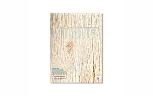
‘World Wildlife Magazine’
Editorial design for World Wildlife Fund's magazine

‘Stanley Kubrick: The Exhibition’
Exhibition design for the Design Museum’s Kubrick retrospective

Starbucks
Environmental installation and augmented reality experience for a Milan flagship