

Porsche
Social media campaign for Ramadan, connecting moments of collective celebration and individual contemplation.
Battersea
Brand strategy, tone of voice and visual identity for iconic British charity

Mastercard
Brand identity to emphasize simplicity, connectivity and seamlessness

‘Minx’
Seventies feminist graphics and vintage erotica inspire the magazine design and titles for the streaming comedy series

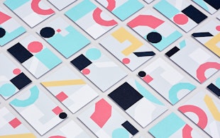
Platform
Identity for the organization dedicated to entrepreneurial diversity

Rathfinny
Brand strategy and visual identity for a 600-acre wine estate

Remission Biome
Brand identity for the radical new patient-centered healthcare organization.

Wien Modern
Identity and typeface design for an Austrian music festival

Materials for the Arts
Identity refresh for a program providing supplies and inspiration to NYC’s artistic and educational communities
Chrysler Museum of Art
Visual identity for the museum in Norfolk, Virginia.

Chatsworth
Brand identity for Chatsworth and the Devonshire Group.

Curtis Institute of Music
Identity for the prestigious private conservatory in Philadelphia

Advocates for Trans Equality
Brand positioning, naming, identity, and website for the transgender advocacy organization.

‘Girls5Eva’
Title animations and graphics for the Emmy-nominated comedy series

‘One Day’
Title card and graphics for the Netflix series based on David Nicholls’s best-selling novel

‘La Lettura’
Data visualizations for the weekly cultural supplement of Corriere della Sera

Viren
Naming, strategy and brand identity for a new high-performance activewear and loungewear apparel brand.
Graphcore
Identity, typeface and pattern generator for a machine learning start-up

Shake Shack
Identity, packaging, and signage for the popular burger chain

Circular 19
The 2016 edition of The Typographic Circle’s type-heavy magazine

DC Entertainment
Identity and logo for the iconic entertainment company
Milly
Identity and packaging design for Michelle Smith's label

The Old Vic
A story-driven identity for one of Britain’s best-known theatres

Saks Fifth Avenue
Identity and packaging for the iconic New York retailer

Metropolis by Marcus Samuelsson
Identity for the restaurant at the new Perelman Performing Arts Center in Lower Manhattan

Oregon State University
Logo and identity for Beaver Nation

Warner Music Group
A bold and off-kilter brand proposition amplifies the vision and voice of an entertainment icon.
The Barnes Foundation
Identity, wayfinding, and website design for the museum

William Morris Society
Identity for society dedicated to William Morris, an icon of Victorian Britain

College Football Playoff
Identity and product design for the football championship of the NCAA