

Manuvo ‘Changemakers’
Branding for a documentary series to promote social change.

'Dear G20 Leaders'
A new campaign calling for global financial reform.

Isomorphic Labs
Beautiful Symmetry: Pentagram’s new website for Isomorphic Labs creates a new visual language for digital biology

Porsche
Social media campaign for Ramadan, connecting moments of collective celebration and individual contemplation.

Remission Biome
Brand identity for the radical new patient-centered healthcare organization.

‘One Day’
Title card and graphics for the Netflix series based on David Nicholls’s best-selling novel

‘Girls5Eva’
Title animations and graphics for the Emmy-nominated comedy series

‘Minx’
Seventies feminist graphics and vintage erotica inspire the magazine design and titles for the streaming comedy series
Chrysler Museum of Art
Visual identity for the museum in Norfolk, Virginia.

Viren
Naming, strategy and brand identity for a new high-performance activewear and loungewear apparel brand.

Chatsworth
Brand identity for Chatsworth and the Devonshire Group.

Warner Music Group
A bold and off-kilter brand proposition amplifies the vision and voice of an entertainment icon.

Yale School of Architecture
Promotional posters for the school's lectures and events
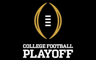
College Football Playoff
Identity and product design for the football championship of the NCAA

‘Designed by Apple in California’
Book design that chronicles 20 years of Apple design
Spiritland
A waveform-inspired identity for a venue with a world-class sound system
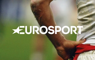
Eurosport
Identity for the pan-European television sports network

Teabox
Identity, packaging, and website design for the tea commerce company

Circular 19
The 2016 edition of The Typographic Circle’s type-heavy magazine

The Harley-Davidson Museum
Design of a museum for the iconic American motorcycle

‘Fantastic Beasts and Where to Find Them’
Logo for the film that explores a new era in the Wizarding World

‘A Glacier's Requiem’
Book and record cover for photographic and audio recordings of melting glaciers

MahaNakhon
Dynamic digital wall for the tallest skyscraper in Bangkok
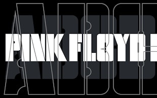
Pink Floyd Records
Identity and record design for the band’s new label

Resonate
Identity, font and glyph system for an international digital arts festival

Index Ventures
Brand identity for Europe's leading venture capital firm

Citibank
Brand identity for the world's largest financial institution
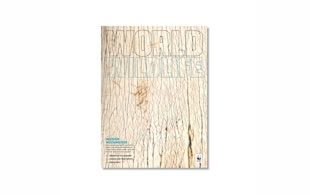
‘World Wildlife Magazine’
Editorial design for World Wildlife Fund's magazine

‘Stanley Kubrick: The Exhibition’
Exhibition design for the Design Museum’s Kubrick retrospective

‘La Lettura’
Data visualizations for the weekly cultural supplement of Corriere della Sera