

Warner Music Group
A bold and off-kilter brand proposition amplifies the vision and voice of an entertainment icon.
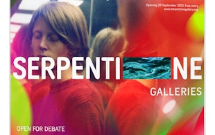
Serpentine Galleries
Brand identity for a British cultural giant

Curtis Institute of Music
Identity for the prestigious private conservatory in Philadelphia

The Old Vic
A story-driven identity for one of Britain’s best-known theatres

Porsche
Social media campaign for Ramadan, connecting moments of collective celebration and individual contemplation.

‘One Day’
Title card and graphics for the Netflix series based on David Nicholls’s best-selling novel
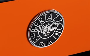
Bertazzoni
Ten years of design for a premium Italian manufacturer of kitchen products

‘Designed by Apple in California’
Book design that chronicles 20 years of Apple design

Platform
Identity for the organization dedicated to entrepreneurial diversity

Oregon State University
Logo and identity for Beaver Nation

Mulberry
The story behind the luxury brand
Chrysler Museum of Art
Visual identity for the museum in Norfolk, Virginia.

Chatsworth
Brand identity for Chatsworth and the Devonshire Group.

MIT Media Lab
Identity and wayfinding for the interdisciplinary research lab

Remission Biome
Brand identity for the radical new patient-centered healthcare organization.

‘La Lettura’
Data visualizations for the weekly cultural supplement of Corriere della Sera
Graphcore
Identity, typeface and pattern generator for a machine learning start-up
London Design Festival 2016
Pentagram's tenth identity for one of the world's biggest design events

Materials for the Arts
Identity refresh for a program providing supplies and inspiration to NYC’s artistic and educational communities

Citibank
Brand identity for the world's largest financial institution

‘Border City’
Digital installation design for the London Design Biennale

Wien Modern
Identity and typeface design for an Austrian music festival

Advocates for Trans Equality
Brand positioning, naming, identity, and website for the transgender advocacy organization.

Viren
Naming, strategy and brand identity for a new high-performance activewear and loungewear apparel brand.

‘Girls5Eva’
Title animations and graphics for the Emmy-nominated comedy series

The Harley-Davidson Museum
Design of a museum for the iconic American motorcycle

State Farm Stadium
A bold and iconic environmental graphic program for the Arizona Cardinals home and stadium

Metropolis by Marcus Samuelsson
Identity for the restaurant at the new Perelman Performing Arts Center in Lower Manhattan

‘Minx’
Seventies feminist graphics and vintage erotica inspire the magazine design and titles for the streaming comedy series

Leafs by Snoop
Identity, packaging, and website design for Snoop Dogg's marijuana line