

Windham Campbell Prizes 2024
Identity for the literary awards and festival at Yale University.

Foster + Partners Industrial Design
Repositioning the industrial design offer within the renowned architecture firm.

Just
Brand identity for a charity providing support and nurturing homes for people with mental health challenges, learning disabilities and homelessness.

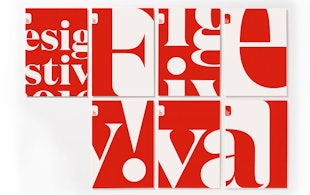
Laurence King Publishing
Creative direction and design for the UK’s most innovative design-led publisher.

OSL
Brand identity for a digital asset platform setting the global standard for innovation, performance, security and compliance.

‘1,000 Marks by Pentagram’
A new, expanded edition of our famous Red Book.

Fortuny
Brand identity for the esteemed company producing high-end fabrics and textiles in Venice, Italy
Zeff
Identity for the small British company behind the world’s first 100% recycled (and recyclable) recycling bin.

Rare Violins of New York
Identity and website for the internationally renowned dealer and restorer of rare antique and contemporary violins, violas, cellos and bows.

Cha Cha Festival
Identity for an immersive celebration of Asian teas and their rich cultural heritage, presented by Water Street Projects

Saturday Night Live Season 50
A new identity and opening title sequence celebrate a landmark season for the legendary sketch comedy show

Williamstown Theatre Festival
A new visual identity for one of the most prestigious festivals in the US, with over seven decades of helping to shape the American theater

MIT Media Lab
Identity and wayfinding for the interdisciplinary research lab

State Farm Stadium
A bold and iconic environmental graphic program for the Arizona Cardinals home and stadium

Mastercard
Brand identity to emphasize simplicity, connectivity and seamlessness

Resonate
Identity, font and glyph system for an international digital arts festival

William Morris Society
Identity for society dedicated to William Morris, an icon of Victorian Britain

‘Border City’
Digital installation design for the London Design Biennale
London Design Festival 2016
Pentagram's tenth identity for one of the world's biggest design events

‘Exhibitionism – The Rolling Stones’
Book design for the legendary band's most comprehensive monograph

‘Fantastic Beasts and Where to Find Them’
Logo for the film that explores a new era in the Wizarding World

Wien Modern
Identity and typeface design for an Austrian music festival

Cooper Hewitt Smithsonian Design Museum
Identity, website, and wayfinding design for the museum
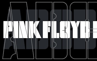
Pink Floyd Records
Identity and record design for the band’s new label
Spiritland
A waveform-inspired identity for a venue with a world-class sound system
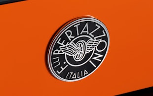
Bertazzoni
Ten years of design for a premium Italian manufacturer of kitchen products
The High Line
Identity, wayfinding, and promotional materials for the elevated park
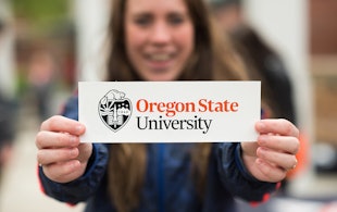
Oregon State University
Logo and identity for Beaver Nation
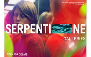
Serpentine Galleries
Brand identity for a British cultural giant

Starbucks
Environmental installation and augmented reality experience for a Milan flagship