

Isomorphic Labs
Beautiful Symmetry: Pentagram’s new website for Isomorphic Labs creates a new visual language for digital biology

Porsche
Social media campaign for Ramadan, connecting moments of collective celebration and individual contemplation.

Remission Biome
Brand identity for the radical new patient-centered healthcare organization.

‘One Day’
Title card and graphics for the Netflix series based on David Nicholls’s best-selling novel

‘Girls5Eva’
Title animations and graphics for the Emmy-nominated comedy series

‘Minx’
Seventies feminist graphics and vintage erotica inspire the magazine design and titles for the streaming comedy series
Chrysler Museum of Art
Visual identity for the museum in Norfolk, Virginia.

Viren
Naming, strategy and brand identity for a new high-performance activewear and loungewear apparel brand.

Chatsworth
Brand identity for Chatsworth and the Devonshire Group.

Warner Music Group
A bold and off-kilter brand proposition amplifies the vision and voice of an entertainment icon.

Advocates for Trans Equality
Brand positioning, naming, identity, and website for the transgender advocacy organization.

Metropolis by Marcus Samuelsson
Identity for the restaurant at the new Perelman Performing Arts Center in Lower Manhattan

Yale School of Architecture
Promotional posters for the school's lectures and events

Toronto Pearson Airport
Wayfinding for Terminal 1 at the international airport
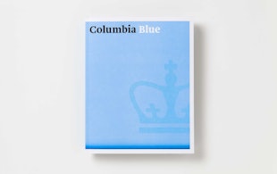
Columbia University Admissions
Program of print materials for Columbia University Admissions

Resonate
Identity, font and glyph system for an international digital arts festival

Eurosport
Identity for the pan-European television sports network

‘Border City’
Digital installation design for the London Design Biennale

Circular 19
The 2016 edition of The Typographic Circle’s type-heavy magazine

The Harley-Davidson Museum
Design of a museum for the iconic American motorcycle

Leafs by Snoop
Identity, packaging, and website design for Snoop Dogg's marijuana line

Wien Modern
Identity and typeface design for an Austrian music festival

Cooper Hewitt Smithsonian Design Museum
Identity, website, and wayfinding design for the museum
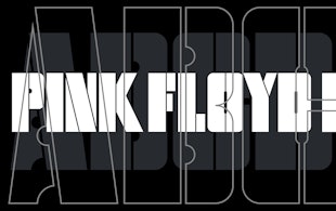
Pink Floyd Records
Identity and record design for the band’s new label
Spiritland
A waveform-inspired identity for a venue with a world-class sound system

Index Ventures
Brand identity for Europe's leading venture capital firm

Shake Shack
Identity, packaging, and signage for the popular burger chain

Kikori Whiskey
Identity, packaging, and print collateral for the Japanese whiskey
Battersea
Brand strategy, tone of voice and visual identity for iconic British charity

Starbucks
Environmental installation and augmented reality experience for a Milan flagship