

Chatsworth
Brand identity for Chatsworth and the Devonshire Group.

Curtis Institute of Music
Identity for the prestigious private conservatory in Philadelphia
The High Line
Identity, wayfinding, and promotional materials for the elevated park

Mulberry
The story behind the luxury brand
Chrysler Museum of Art
Visual identity for the museum in Norfolk, Virginia.

‘Minx’
Seventies feminist graphics and vintage erotica inspire the magazine design and titles for the streaming comedy series
College Football Playoff
Identity and product design for the football championship of the NCAA

‘Designed by Apple in California’
Book design that chronicles 20 years of Apple design

Metropolis by Marcus Samuelsson
Identity for the restaurant at the new Perelman Performing Arts Center in Lower Manhattan
Index Ventures
Brand identity for Europe's leading venture capital firm

‘Girls5Eva’
Title animations and graphics for the Emmy-nominated comedy series
Graphcore
Identity, typeface and pattern generator for a machine learning start-up

Wien Modern
Identity and typeface design for an Austrian music festival

Remission Biome
Brand identity for the radical new patient-centered healthcare organization.
Milly
Identity and packaging design for Michelle Smith's label
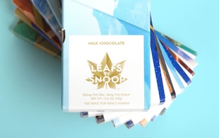
Leafs by Snoop
Identity, packaging, and website design for Snoop Dogg's marijuana line

‘One Day’
Title card and graphics for the Netflix series based on David Nicholls’s best-selling novel

‘Exhibitionism – The Rolling Stones’
Book design for the legendary band's most comprehensive monograph

Porsche
Social media campaign for Ramadan, connecting moments of collective celebration and individual contemplation.

Warner Music Group
A bold and off-kilter brand proposition amplifies the vision and voice of an entertainment icon.

‘Stanley Kubrick: The Exhibition’
Exhibition design for the Design Museum’s Kubrick retrospective

Viren
Naming, strategy and brand identity for a new high-performance activewear and loungewear apparel brand.

Advocates for Trans Equality
Brand positioning, naming, identity, and website for the transgender advocacy organization.

The Old Vic
A story-driven identity for one of Britain’s best-known theatres

‘La Lettura’
Data visualizations for the weekly cultural supplement of Corriere della Sera

Cooper Hewitt Smithsonian Design Museum
Identity, website, and wayfinding design for the museum

Kikori Whiskey
Identity, packaging, and print collateral for the Japanese whiskey

Circular 19
The 2016 edition of The Typographic Circle’s type-heavy magazine

Isomorphic Labs
Beautiful Symmetry: Pentagram’s new website for Isomorphic Labs creates a new visual language for digital biology
MIT Media Lab
Identity and wayfinding for the interdisciplinary research lab